
Box Plots
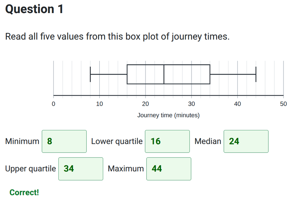
Practise reading, drawing and comparing box plots in this GCSE Grade 6 Statistics worksheet. Use the five-number summary to describe journey times, calculate range and interquartile range, and compare typical values and consistency.
Work from raw data, missing summary values and cumulative-frequency graphs, then construct box plots and check your answers one question at a time. Jump to the questions
Practise now
Worksheet preview and key skills
Worksheet preview
Eight questions progress from reading a box plot to constructing and comparing two distributions on a common scale. Each complete question earns one mark.
For example, a minimum of 3, lower quartile of 11, median of 23, upper quartile of 37 and maximum of 49 give a range of 46 and an IQR of 26. A box runs from 11 to 37, with its median line at 23 and whiskers ending at 3 and 49.
What you’ll practise
- Reading the five-number summary and calculating range and IQR.
- Constructing box plots from summaries, raw data and missing values.
- Estimating counts from quartiles and reading quartiles from cumulative frequency.
- Comparing typical journey times using medians and consistency using IQRs.
Use the interactive worksheet below, or read the Topic guide for the method and worked example.
Box Plots
Drag the labelled handles to construct each box plot. Complete every part before checking; each numbered question is worth one mark.
Topic guide
The five-number summary
A box plot summarises a distribution using its minimum, lower quartile (LQ), median, upper quartile (UQ) and maximum, in that order. The whisker end caps show the minimum and maximum. The box starts at LQ and ends at UQ; the line inside it shows the median.
Range and interquartile range
Range = maximum − minimum. Interquartile range (IQR) = UQ − LQ. The range describes the spread of all the data; the IQR describes the spread of the middle 50%.
If the minimum is 3 minutes and the range is 46 minutes, the maximum is 3 + 46 = 49 minutes. If LQ is 11 minutes and the IQR is 26 minutes, UQ is 11 + 26 = 37 minutes.
Drawing a box plot
Use a numbered scale with equal intervals. For the summary 3, 11, 23, 37, 49, draw the box from 11 to 37 and a median line at 23. Draw whiskers from the centre of the box sides to end caps at 3 and 49. Keep both whiskers on the same horizontal line. All values here are in minutes.
Starting with raw data
Put the data in ascending order first. Find the median, then leave it out when splitting these odd-sized datasets into a lower half and an upper half. LQ is the median of the lower half; UQ is the median of the upper half.
For the 11 sorted values 3, 7, 11, 15, 17, 23, 27, 33, 37, 43, 49, the median is the 6th value, 23. LQ is the 3rd value, 11, and UQ is the 9th value, 37. The five-number summary is 3, 11, 23, 37, 49. Range = 46 and IQR = 26.
This worksheet uses 11 or 15 values so these positions are unambiguous. With 15 values, use the 8th value for the median, the 4th for LQ and the 12th for UQ.
Quartiles and counts
About 25% of the data lie below LQ, 50% below the median and 75% below UQ. The middle 50% lie between LQ and UQ; about 25% lie above UQ. These are estimates when interpreting a box plot.
For 100 pupils, about 50 pupils lie between the quartiles and about 25 pupils lie above UQ. The widths of the sections show spread, not different numbers of pupils.
Comparing distributions in context
Use the median to compare typical values and the IQR to compare the spread of the middle 50%. For example, if Group A has median journey time 23 minutes and IQR 26 minutes, while Group B has median 29 minutes and IQR 30 minutes, Group A typically has shorter journeys and its middle 50% of journey times are less spread out.
A smaller IQR means the middle 50% is less spread out; it does not mean every value is closer together. Include both comparisons and name the quantity being measured.
From cumulative frequency to a box plot
For a stated total of n, find cumulative frequencies n ÷ 4, n ÷ 2 and 3n ÷ 4. From each level, read horizontally to the curve, then vertically down to the data axis. These give LQ, median and UQ. For 100 pupils the three levels are 25, 50 and 75.
Use the supplied minimum and maximum for the whisker ends. A grouped cumulative-frequency curve uses class boundaries, which need not be the smallest and largest actual values. In Question 7, read to the nearest minute and place the quartile handles at those same estimates; one small graph division of reading tolerance is allowed.
Common mistakes
- Subtracting the endpoints for IQR: use UQ − LQ instead.
- Finding quartiles before sorting the raw data.
- Using quartile cumulative-frequency levels as the box-plot values: read across to the curve and down to the time axis.
- Assuming the median must sit halfway across the box.
- Comparing only medians, or using the range when asked about the middle 50%: compare IQRs as well.