
Scatter graphs
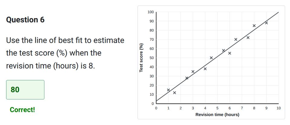
Practise plotting, reading and interpreting scatter graphs, including drawing lines of best fit.
In this worksheet, you will look at correlation, identify outliers, estimate values using your line of best fit, and understand the difference between correlation and causation. Jump to the questions
Practise now
Worksheet preview and key skills
Worksheet preview
This worksheet tests your ability to interpret and construct scatter graphs using interactive charting tools.
You will identify different types of correlation, recognise outliers, plot your own data points, and position a line of best fit.
What you’ll practise
- Identifying positive, negative, and no correlation.
- Plotting coordinates onto a scatter graph correctly.
- Drawing an estimated line of best fit.
- Interpolating values from a line of best fit.
- Explaining why extrapolation is unreliable and why correlation does not prove causation.
Use the interactive worksheet below, or read the Topic guide for the method and worked example.
Scatter graphs
Practise plotting, reading and interpreting scatter graphs.
Topic guide
A scatter graph shows pairs of data plotted on a coordinate grid. By looking at how the points are arranged, you can tell if there is a relationship between the two variables.
Correlation
Correlation describes the relationship between the two variables.
- Positive correlation: As one variable increases, the other increases. The points generally trend upwards from left to right.
- Negative correlation: As one variable increases, the other decreases. The points generally trend downwards from left to right.
- No correlation: The points are scattered randomly with no clear pattern.
The strength of the correlation depends on how closely the points follow the trend. If they are tightly packed together, the correlation is strong. If they are spread out, it is weak.
Outliers
An outlier is a data point that does not fit the general trend. It stands clearly apart from the rest of the plotted points.
Line of best fit
If there is a clear correlation, you can draw a line of best fit. This is a straight line that passes as close to as many points as possible, with roughly the same number of points above and below the line.
- It does not have to go through the origin (0, 0).
- It does not have to connect the first and last points.
- It must follow the general direction of the data.
Interpolation and Extrapolation
You can use the line of best fit to make estimates.
Interpolation is estimating a value inside the range of your plotted data. This is usually reliable.
Extrapolation is predicting a value outside the range of your plotted data by extending the line. This is much less reliable because there is no guarantee the mathematical trend continues.
Correlation vs Causation
Just because two variables show a correlation, it does not mean that a change in one causes the change in the other. Both might be caused by a third, hidden factor, or the link might just be a coincidence.
Worked example
Question: Plot the following data for temperature and ice cream sales, draw a line of best fit, and use it to estimate sales at 22°C.
- (10°C, £120)
- (15°C, £180)
- (20°C, £250)
- (25°C, £310)
- (30°C, £400)
Step 1: Plot the points
Mark each coordinate accurately on the grid. Ensure you use the correct scale for both the x-axis and y-axis.
Step 2: Draw the line of best fit
Draw a straight line that follows the trend of the data (positive correlation). Try to keep the same number of points above and below the line.
Step 3: Interpolation
Find 22°C on the x-axis. Draw a line straight up to your line of best fit, then straight across to the y-axis. The reading on the y-axis (e.g. £280) is your estimate.
Common mistakes
- Confusing strength with steepness: A strong correlation means the points are tightly clustered around the line, not that the line is steep.
- Forcing a line through the origin: A line of best fit does not have to start at (0, 0).
- Joining the plotted points: You should draw a single straight line, not a zig-zag connecting the dots like a line graph.
- Assuming extrapolation is reliable: Predicting outside the observed data range is risky because the mathematical trend may change.
- Assuming correlation proves causation: Two linked variables do not prove one causes the other.